
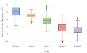
Medan – November 1st, 2022. At this time, the development of science and technology is so rapid that from time to time there are only the latest techniques that appear to interpret the conditions of the test result data. Currently, a method of displaying test data that is gaining popularity and is widely used is the Boxplot graph method. This method was developed from the basic principle of the five statistical series, namely the maximum value, upper quartile, median, lower quartile, and minimum value.
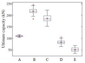
One interpretation of the Boxplot graph is to provide an overview of the data distribution conditions from the test results. An example is the Boxplot graphic image above. In the graph, it can be seen that the load capacity of variation B is higher compared to other variations. The data range of variation B ranges from 190 to 240 kN and the average value ranges from 220 to 230 kN. However, the best data distribution is found in variation A because the variation is very small compared to the shape of a denser (thinner) box.